ARYZE were in need of a brand package for a new development they had underway at 1693 Fort St. The brief was clear: stylish rental apartments, car-lite, great proximity to groceries and services, and in the neighbourhood always well known for its access to the hospital.
Give it a name and a feeling.

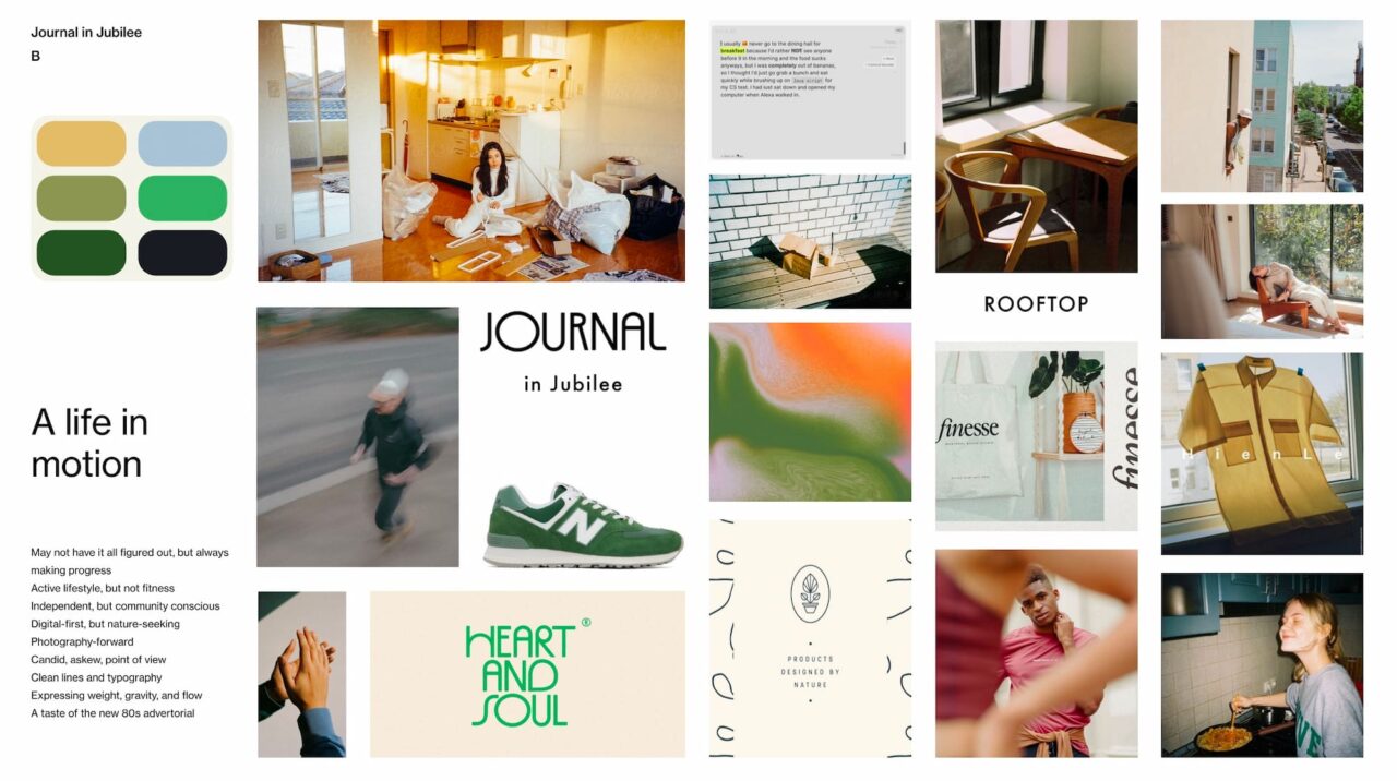
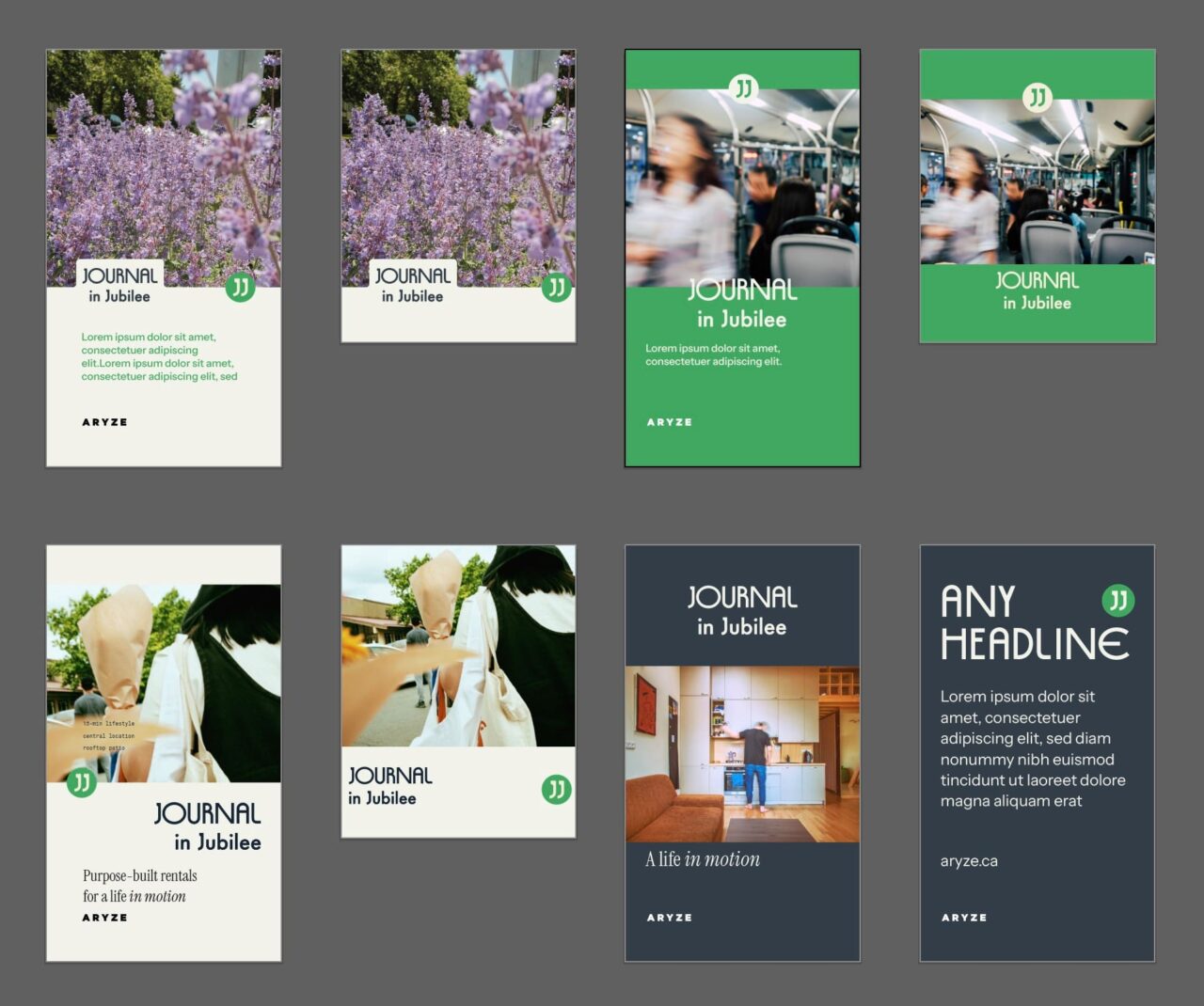
After strolling the neighbourhood for inspiration, collecting some photos and taking some notes, it all kind of clicked. I pitched Journal in Jubilee to the team and we could all feel how right it was. Academic but approachable. Snappy but descriptive. It even tied to the architect’s vision of the exteriors resembling bookshelves.
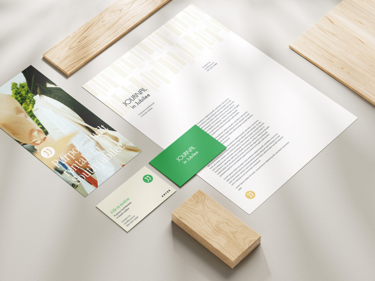
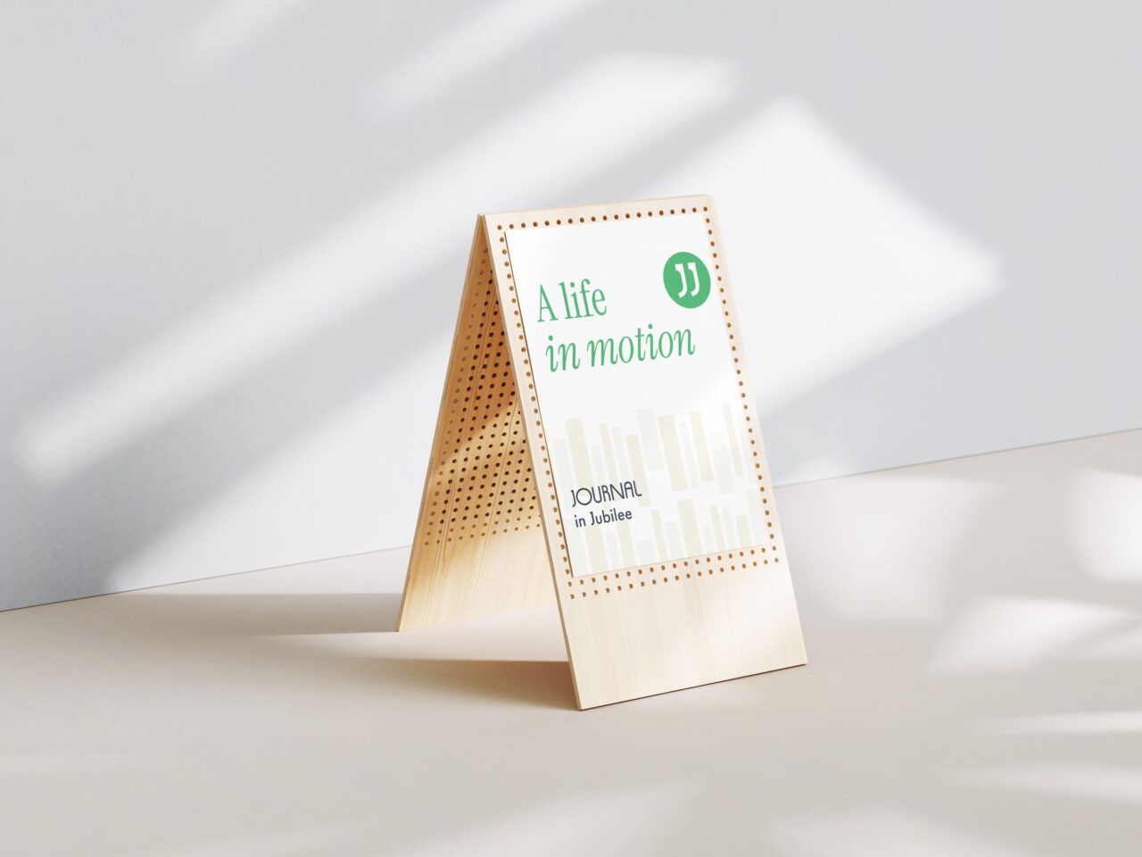
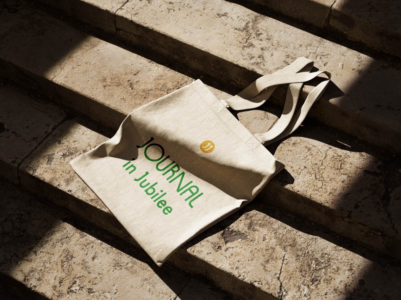
The ARYZE team are absolute pros at making the most of an idea, and from the simple brand package and naming delivered they brought every element to life.
View the project on the ARYZE website and learn more