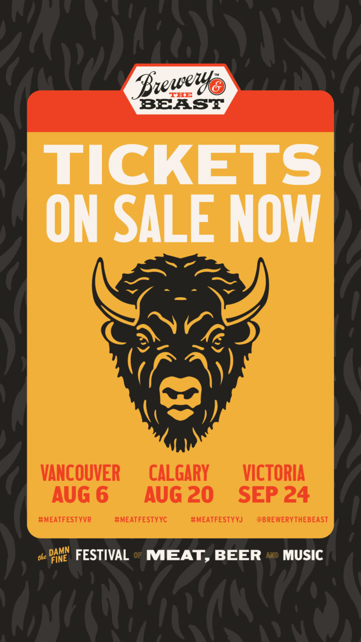
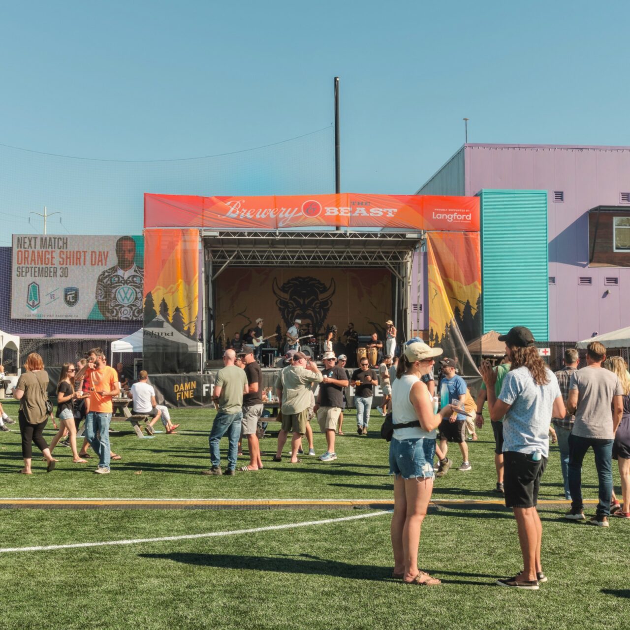
First of all, Brewery and the Beast is such a great event. It may only last a few hours, but it is pure indulgence and you are for sure leaving stuffed full of the best food in the region. When the 17 Black team came to me looking for design help, that pitch wasn’t really clear in their brand. This is a damn good time; it’s high quality; it’s completely unpretentious; it’s full of energy; it’s true to honouring the crafts that go into the food we love.
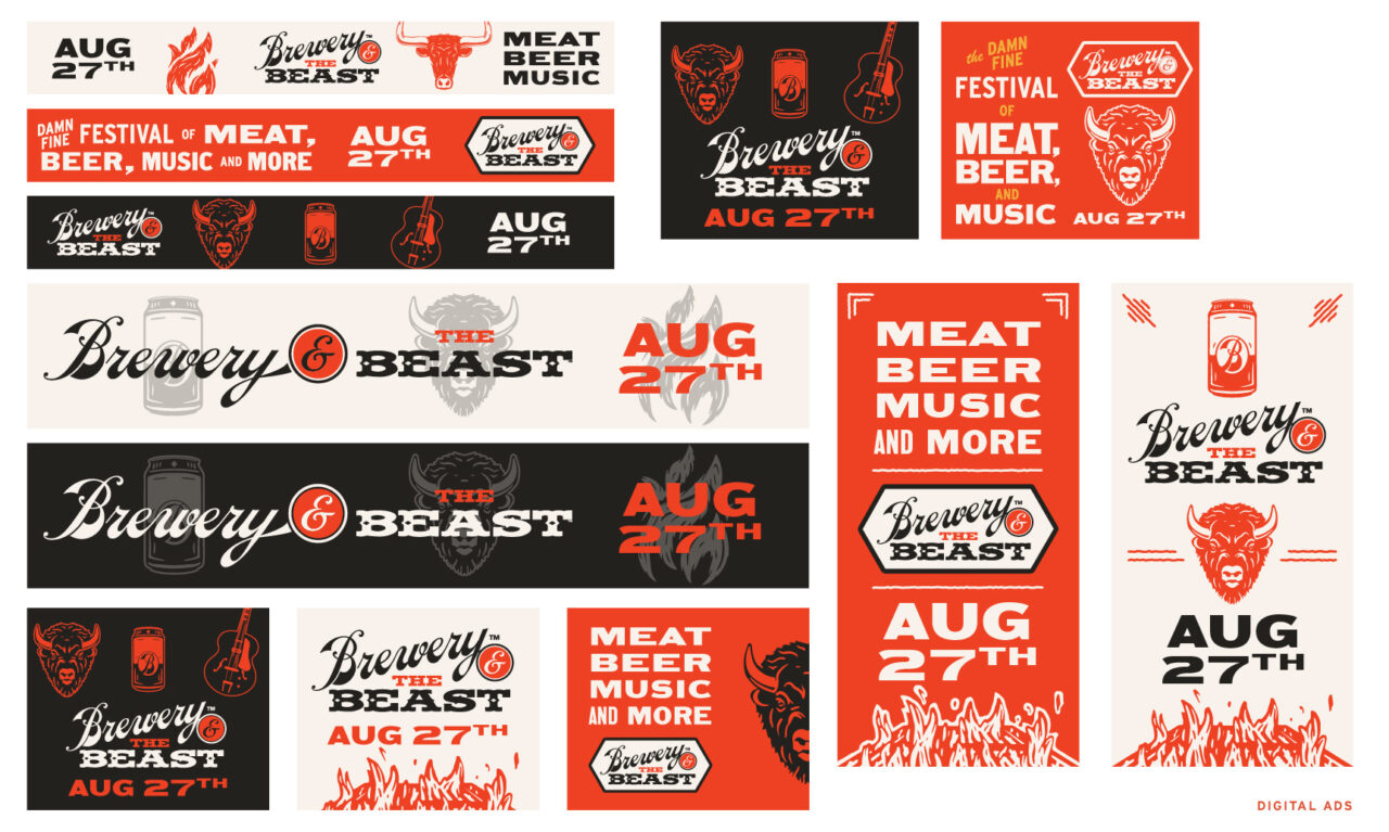
So we kept the classic logo (by the fantastic Shawn O’Keefe, longtime artist and designer for Phillips Brewing) and rebuilt from there. Where festivals, beer events, and meat anythings can easily fall into patterns of overly-masculine stereotypes, we steered this truck towards a more welcoming space for everyone.
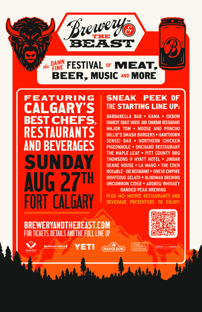
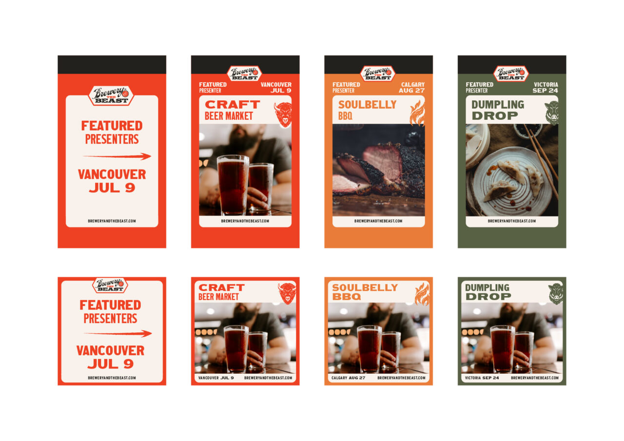
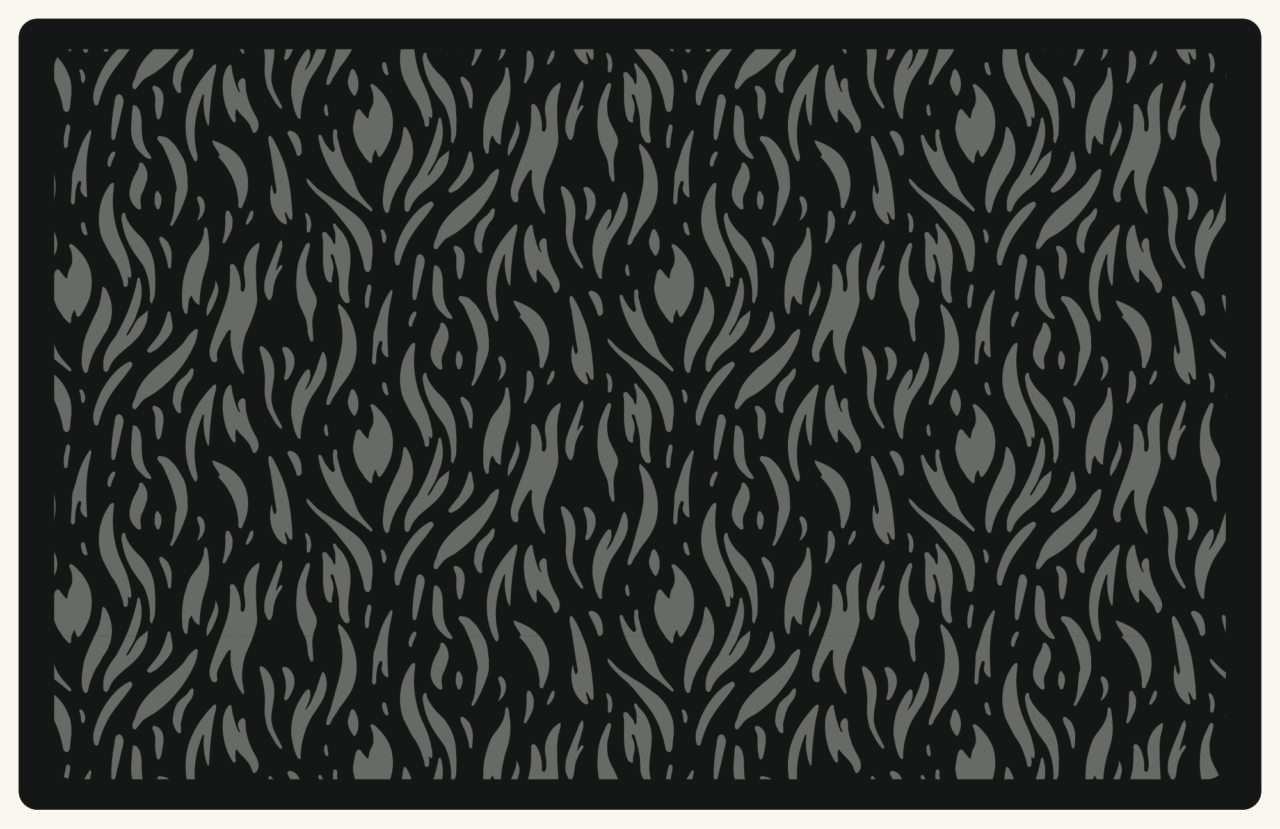
The brand relies on classic typography of the butcher shops, BBQ smoke shacks, and farm stands that stewarded and honed the crafts of these artisans. And new handmade icons illustrate the core offerings of the events in super easy-to-use forms.
It balances an intensity and seriousness, because it’s great at what it does. But the soft edges, tasty colours, and friendly tone let everyone know they’re invited to dig in.