Leah came to me with the top-secret news that she was opening a gift shop of her own, and I was over the moon. We’ve been pals for many years, and I worked with her through a brand refresh when she was at Oscar and Libby’s before. Everything she was asking for was exactly what felt right: friendly, easy-to-use, clean and simple, and in delicious hues of a perfect summer sunset.
The timeline was tight and there wasn’t really any room to mess it up, so I got to work immediately. Sometimes that pressure and confidence is just what’s needed.
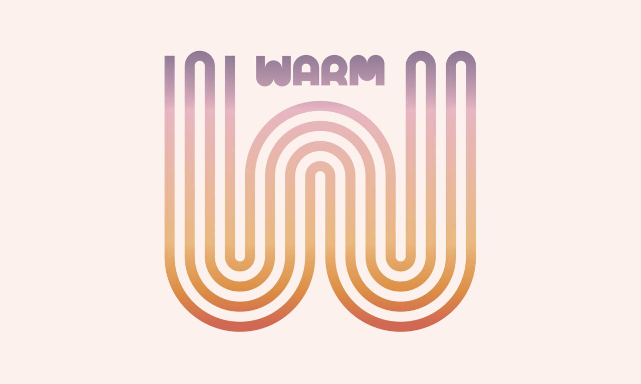
The smooth, charming, noodle-y wordmark came together first out of some hand sketches. Working with a four-letter word is a dream. Simple and sturdy and proportions that can play anywhere. I couldn’t stop making variants of it, and knew it had to be a goodie.
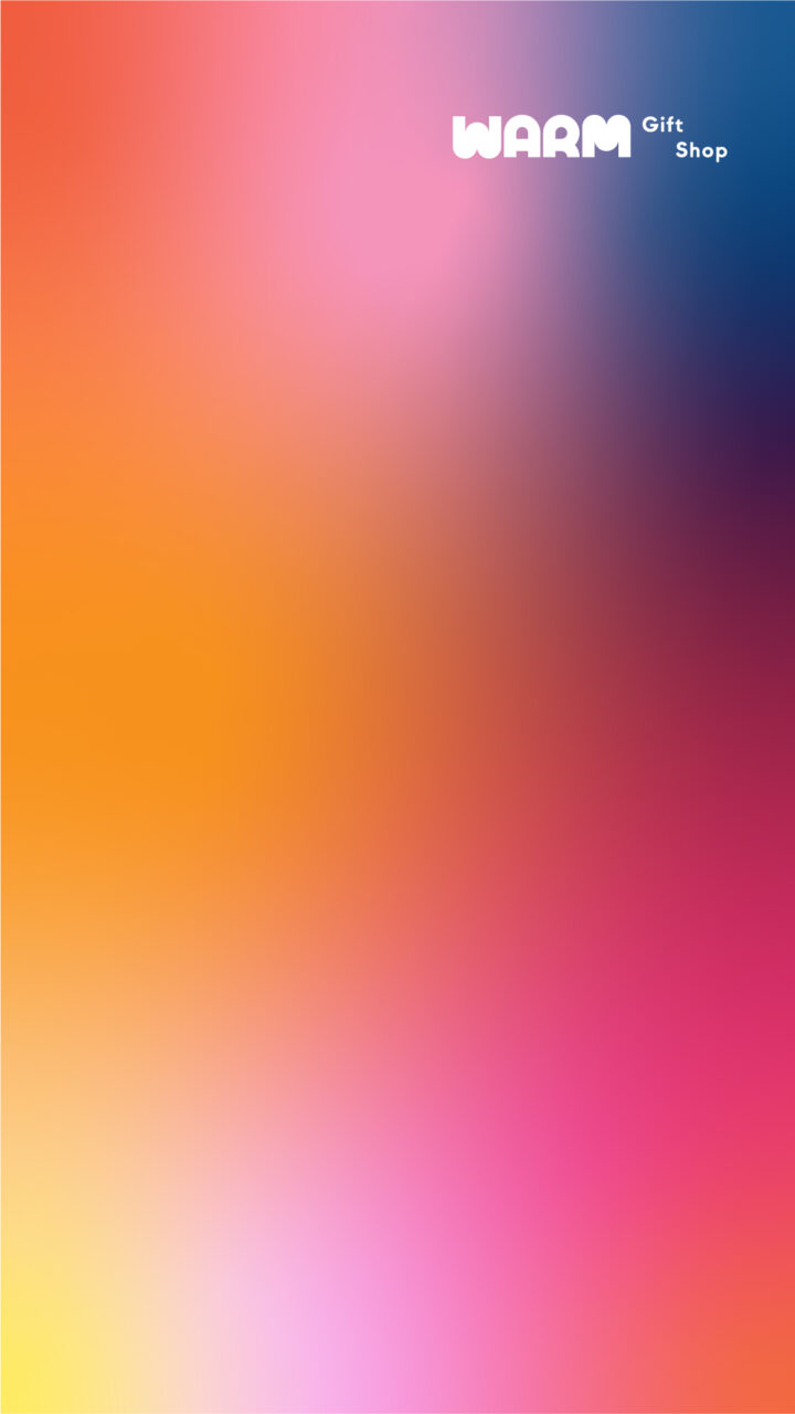
I put together a versatile and playful colour palette (without being a full-on rainbow) and blended it all up to show Leah. I gave her plenty of room for revision if she didn’t love it, promising to hustle to make sure this new venture was really her dream. But it was a “no notes” win.
Export. Print. Open.
The shop had its first anniversary not long ago, and they’ve kept these piece I made going so strong. They’ve got really nice shop signage up, the social posts are always beautiful, and this visual identity and vibe of the space all feel super cohesive. I love being able to pop in, see what they’ve created with where it began, and indulge in their lovely curations.